Tuesday, 6 October 2015
Image Bank - Tone
Image Bank - Tone
I like this photo because I can really see the tone of this photo, it's not the best one of the five, I like photographs of nature like this, flowers are probably my favourite.
I love this photograph because the Rock has a lot of tone, the shadows look good on it but the sky looks odd, I think that it looks quite off putting and it drags your eye away from the rock which is the main object in my opinion.
I like this photograph because it's focus is very well done. I think that the tone is nice but it's a very dark photograph.
I love this because it's a great example of tone, however it could also be texture, I personally think the lighting looks amazing.
This isn't the best photograph but I really like the subject of the photograph.
Definition - Tone
Tone
This refers to the darkness or lightness of something, this
could be a shade or how dark or light a colour is.
Tones are created by the way light falls on a 3D object. The
parts of an object on which the light is it’s strongest.
Lighter tones can be used to show femininity and innocence,
whereas darker tones can be used to show masculinity and power.
This shows tone because you can see from which side the light is hitting the house from. It is quite an isolated looking photograph. It also looks quite masculine because it doesn't contain many curved, it has quite sharp edges.
I like this photograph because it has a lot of tone, there's a lot of shadows in this photograph which shows us that the light source was probably high up in the air when this was taken.
This photograph is an example of tone, I think this photograph is quite odd because I'm not sure what has happened to the floor, however I chose it because the rocks have lots of tone, they have shadows that show the shape of the object a lot better.
Friday, 2 October 2015
Image Bank - Form
Form Image Bank
I like this photograph because it shows form very well, I like that it shows the light shining from the back right, it makes the shape very defined.
I like the lighting in this photograph, it makes the bike seem very reflective, it also makes the shape look very 3D, some photographs look very 2D because the lighting is straight on and that makes the subject have no shadows on it so it looks flat.
This photo shows a lot of form, I love that you can see the bones in the back and that the lighting means that the bones cause shadows, I also like the curve of the light acres the leg, it makes the photograph very 3D and I like that I can tell that it's not just a flat photograph.
I found this photograph, I think that it shows form pretty well, we can see that the light is shining down on the subject from the top, this means that the shadow on the surface isn't too big and the back of the banana is darker, causing it to look more 3D.
This is a good example of form, although I'm not sure about the shininess, I think that might ruin it a bit. However, in my opinion, this shows form very well, the light shining on it causes a lot of reflection and brightness, which means we can see that its not flat.
Work Diary - Pattern
Today I was instructed to get pictures of patterns, I found this task quite challenging because I wasn't finding many patterns around Harlow, however because I researched the element I was able to find some good examples the the photo below. I didn't do any of the shooting in the studio and I found the majority of the photographs inside the college campus.
Progression: Next time I will research patterns more before going out and taking pictures so that I know what I'm looking for, some of mine weren't very good so I may need to take more to replace those at some point.
This is a good example of pattern as the same thing is repeating itself over and over, it is the best photograph I took however there are parts of it that could be better, the photograph isn't very clean so there are little bits that are off-putting like the chewing gum. Also I didn't frame the photograph very well, this could be fixed on photoshop with cropping and rotating.
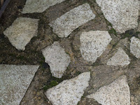
This example isn't as good because there isn't really a pattern, although these shapes are made of the same rock they aren't the same size which makes the photo look more like an example of line or texture in my opinion.
Thursday, 1 October 2015
Colour manipulation
I liked the colours on this photograph, I think that they looked good originally but the background was a bit odd in relation as it was quite a dull colour. I think the colours look more striking with a black and white background
I really like the original colour of the sky as the blue gets lighter and it's very clear with no clouds. However I think that it looks nice when it's all based around one colour, it makes it look like it was taken with a sepia sort of filter, which I really quite like.
Subscribe to:
Posts (Atom)


