Tuesday 29 September 2015

Image Bank - Pattern

This example of texture is really nice because its quite simple, although the stones might not all be the same size or shape they look more or less identical from this angle, I also like that the photo isn't just pattern and that there are other objects that drag your eye like the drain and the bike.

I like this photo because it's not perfect, the shapes aren't all the same size which I think looks quite nice, it's quite refreshing with the bright colours as well.

This pattern repeats lots of times, both as the brick work and as the light shining on the floor. I like this because you can see the pattern repeats all the way round, the ceiling also repeats which looks great swell.

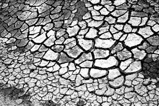
This example of pattern is nice because its repeating itself a lot but the pattern isn't identical. I like it because it's quite eerie as the colour is muted. 

This pattern is not very identical, I think it looks great though because its so odd. Some of the  windows have a duller colour which is quite off-putting as it's not all the same colour, but other than that it looks great.


Definition Post - Form

Definition Post - Form

Form is a three dimensional shape, such as a cube, sphere or a cone. Sculpture and 3D design are about creating forms. In 2D artworks, tone and perspective can be used to create an illusion of form.

This example of form isn't the best, I think it could show texture better, however it does show form, I like it because the depth of field is very well done, and I think that due to the lighting angle we are able to see that it is curved and has a form.

This is an example of the human form, humans and other animals can have beautiful forms, I love this photo because of how the lighting has made it look, theres lots more shadows that create a more 3D shape than if the light was straight on, I also like that it has been edited to be darker, it means you can see the small flaws better which in this photograph looks really good.

This is another example of the human form, however this time it is a female form, I like this picture because there is a lot of negative space, and the body has a lot of shadow, the lighting is quite subtle in this photo in my opinion. I love that you can see all of the muscles and bones. I think this photo is quite interesting as you don't usually see these sort of shadows on the human body form, it's not what a back usually looks like.


Thursday 24 September 2015

Straight Images - Pattern

Best 5 - Pattern

 Original
Copy

Original  
 Copy


Original
Copy

Original
Copy


Contact Sheet - Pattern


These are the photos I took during the lesson that I think best showed pattern, I found this a lot harder than texture and line, I wasn't always sure if something would count as a photograph showing line, or a photograph showing pattern.


Define - Pattern

Pattern

Patterns bring a sense of visual rhythm and harmony to photographs that capture the harmony. Patterns happen whenever strong graphic elements - lines, colours, shape, form - repeat themselves.

This is an example of pattern because the steps keep repeating, I think it looks really good because its very plain, there's no people in the shot which is good. I also like that it is only one colour.

I like this photo because the pattern is almost perfect, all of the cars are the same colour which looks great in my opinion. I also like that the sides of the photo have a pattern as well, with the lines adding to the pattern I think this is my favourite of the pattern photos.

This is an example of a pattern, however it is quite a messy pattern. I love the snake skins pattern repeating over and over again I think it looks really good.

I like this photo because the pattern is symmetrical, I think it looks really really lovely even though the pattern isn't perfect because zebras stripes aren't symmetrical.

Straight Images - Texture

Best 5 - Texture 

Original
Copy

 
Original
Copy


Original
Copy

Work Diary - Colour

Work Diary 

Today I took pictures of colours, I was looking for colours that were contrasted, like purple and yellow (colours that are opposite on the colour wheel), I walked around Harlow town and looked for colours that went together but it was very difficult, orange and green aren't really very commonly found together because they are both very bright and it doesn't always look that good together.

However I didn't get many because I found the task quite challenging, although the world is full of colour I felt like I wasn't finding many colours that went well together, additionally I couldn't work the camera that well as it was a college one that I wasn't familiar with, I found it difficult to focus on things even when using auto-focus which made it very difficult to take good photos.

Progression: Next time I will make sure I know how to use the camera before I go out to take photos. I will also spend some time in the studio room and take some more photos so I can choose what colours I am using. I also think that it was made harder due to the fact that it is autumn so it was darker and less colourful, additionally there are less colours around generally because many of the plants were dead and this meant there was a lot less natural colour.


This is my least favourite photograph because I don't think it is framed very well, I also don't really like the colours, I was looking for green and red and it didn't really look very red, it is quite dull looking.


I like this because I think it is really bright and it stands out quite a lot in contrast to the dull background. This is my favourite colour photograph because of this reason.

Contact Sheet - Texture


These are all the pictures I took relating to texture, I am very happy with the majority of them, however,  it was raining which meant the sun wasn't out so the texture wasn't as good as it should be.

Image Bank - Texture

This is an example of texture, I like this photograph because the texture is very detailed, however the focus is not my favourite thing about this photo because it is unfocused at the bottom and at the top right.

This is a photograph of a wall that shows a lot of texture, not only can we see the texture of the brick, we can also see the texture of the cement. I like this photo because I think it is very well framed and it is very detailed even though the photo wasn't taken very close.

I quite like this photo because I think it looks really gorgeous, although it is taken from quite far away you can still tell that it is very dry which is interesting.

I thought this photo was very cool, I'm not completely sure what it is but you can definitely see what it it feels like. I inspires me to take more photographs of animals because I don't think I have any yet.


Definition Post - Texture

Definition Post - Texture

In some photographs the variation in the light and the dark are so convincing that we can almost 'feel' the texture although it's not actually there. It is this three dimensional 'feel' that convinces us there is a 'texture' on the page.


This is an example of texture, you can really see how it feels and I think it would feel rather rough.

This is also an example of texture, although we can see what this is and we know how it feels its still great that we can see the texture as well

This is an example of a hard and relatively smooth texture, I think this looks really good and I like how much you can tell what it is.

I think this photo looks really good because the ice looks very smooth, however we can also see the texture of the twigs which is quite nice as it is an example of two different textures


Thursday 17 September 2015

Image Bank - Colour

This is an example of analogous colours, meaning they are all colours next to each other on the colour wheel, I like this photo because it looks absolutely beautiful, I think the colours look really nice together and they don't clash at all. This inspires me to take more photos of nature, especially flowers

This is an example of muted colour, I love this because it looks vintage and old, the book has been spread out beautifully and it still looks natural, this makes me want to take photos of objects I'd find at home because I think it looks really good.

This photograph is an example of saturation, meaning it has been made to look brighter than it actually is. This looks really good on pictures outside, especially in the summer, as some photos outside can look quite dreary when you don't want it too so saturation is a good tool to use.

This is an example of complimentary colours, meaning the two colours are opposite on the colour wheel, I think this looks good because the colours are so blocky, there's no clouds in the sky in this photo.


Straight Images - Lines