Tuesday 26 January 2016

Straight Images (updated) - Colour

This is my edited photo of the original below, I have made the wall more orange using colour balance. I did this so that the colours compliment each other more. Doing this made the picture appear warmer as the blue looks darker. I liked the original photograph because I think it was framed well, however with the blue being darker and the wall looking more orange I think it is a lot better. This is one of my favourite photographs that I took today and I used f/5, iso 400 and shutter speed 1/25 to capture the original. 


This is the edit of the photograph below, I love this photograph because I think that the depth of field looks really good. I also like how the contrast looks because I made the sign a richer yellow and the background slightly darker, however I personally think that the original might be better because the photo overall looks darker now that I have edited it.


This edit is a lot better than the original in my opinion because the red looks more red rather than slightly purply like in the original. To do this I used colour balance and I made the red stand out more, I also did this for the green because it was quite a muted green previously. To do this on Colour Balance, I brought the yellow/blue bar down -12 so that there was less blue, this made the postbox more red, I then pulled the green bar up +15 to make the green a lot richer.


This photo is of a red plant next to a green one, I think that the contrast looks really good now that it's been edited, I used colour balance and made the red bar higher, I also used curves to make the photo darker in places, I think that this makes the photo look a lot better as it may have been over-saturated originally.


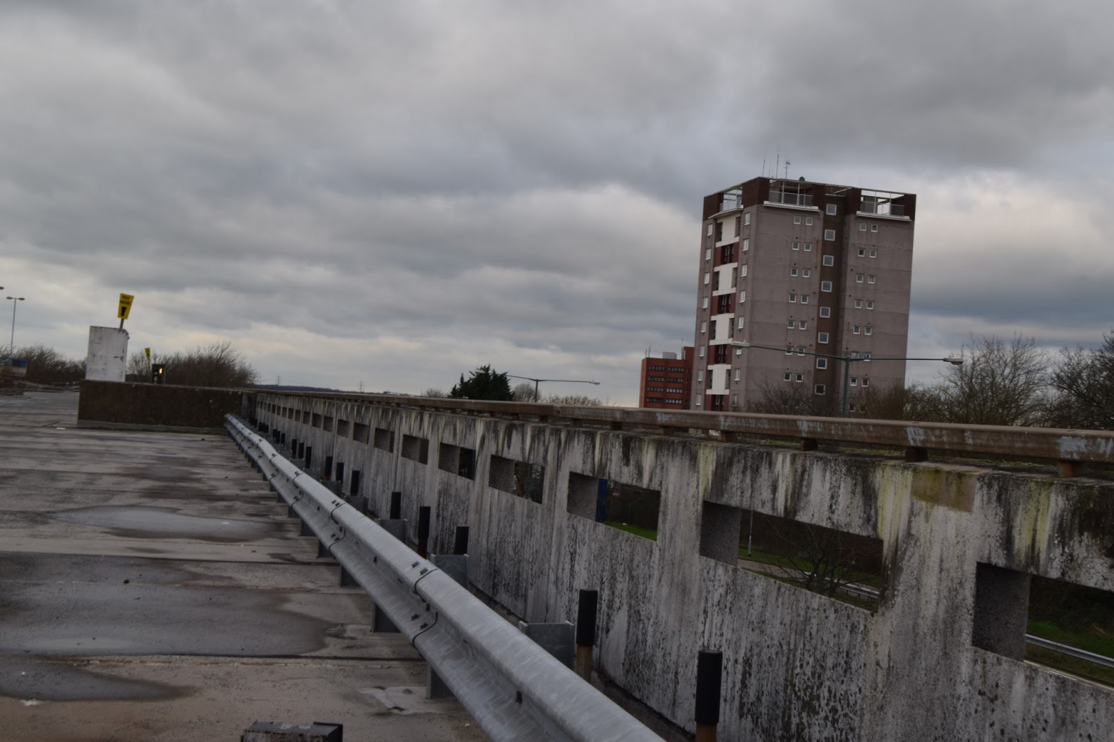
This is the edited photograph, to make this I had to rotate the photograph because it wasn't straight, however, I don't mind the original as I think it was just the angle, I could've left it without rotating and had just a good photo. I also used colour balance to make this, I wanted the photo to look cold so I brought the red/cyan bar down -15 so that the photo was more blue. I additionally used hue/saturation to make the colours more muted as you can see from the colour of the grass in the original compared to the edited one. Then I used curves to make parts of the photograph darker. I think that overall, this photo is one of my best from todays shoot, however it isn't a great example of colour.


Contact Sheet - Landscape


Thursday 21 January 2016

Artist Research - Cedric Delsaux

This photo is by Cedric Delsaux, I love this because all the colours are so similar except for the signs, it is a landscape photograph and I think it is showing us how brands are taking over the world. I think it's beautiful because it's not symmetrical, all the buildings are different sizes, although they all look the same. This particular photo was taken in Hong Kong in China, the clouds at the top could be smog, so the photo could be showing us that the big brands are the ones causing the smog that is ruining their country.


These two photographs go together, they are called Orangutan Cage 1 & 2. I think they portray a very powerful message because when we look at the first photograph we see that it is where a Orangutan is meant to be and should be living, and then number 2 seems completely bleak in contrast. Personally I think that Orangutan's shouldn't be kept in a cage, along with any other animals, putting the two situations next to each other really makes you think about whether keeping animals locked up is any good.


Wednesday 20 January 2016

Image Manipulation - My Edits

Image Manipulation 

This is my edit, I added both a baby penguin and an igloo, I don't think I got the sizes right and I think it looks quite odd. I don't really like this that much but I would like to improve my skills and get better at this because I think it would be a good skill to have.  I need to learn to add shadows in because I don't know how to do this which probably makes it seem unrealistic.


I think this photo is a lot better than the first one because it looks more realistic, I took these photos which meant that I had more control than before when I had to get the photo's from the internet. I preferred this a lot more as I had a greater choice. This was part of my fourth plinth work, personally I don't really like the fourth plinth because although some of the artwork is incredible, I don't think it looks good and it can just look rather tacky. However it is a very open project idea where you can just do as you wish. This photo almost looks 3D because the rubik cube is very clear whilst the landscape isn't as clear.

I took this photo of the rubiks cube to put on the landscape photo I already had a photo of, to take this I used the settings iso 200, f.9 and shutter speed 1/125.


Straight Images - Landscape

 This is my final edit of the photograph, I took this using the settings f.22 and iso 200, the shutter speed changed depending on how dark it was because my camera was on aperture priority. I used rotation to level this photo out more because although I used a tripod, I didn't set it up very well so it was a slanted photograph. I also edited it using curves, I made the photograph a bit darker but I'm not sure if I like it because I think it might look too dark 

This is the original photograph, it is slanted and therefore I don't think it looks very good, it looks quite unprofessional unlike the edited photo.

 I didn't need to straighten this photograph because it was already straight, however I decided to make it black and white, slightly inspired by Ansel Adams, however Adams used a very big contrast in his photos, I didn't want to do that because I didn't think it would look that good in this photo. I used f.3.5 and iso 3200 for this photo, I should've used a tripod for this photo like I did with the last one, it would've been better and I could've taken a better photo.


I really liked this photo because it looked very urban, however I felt that as it's meant to be inspired by Rut Blees Luxemburg, that it was too bright, I couldn't take this photo at night like she took her photos but I tried to make it darker using saturation, I lowered the saturation of the photograph. By doing this I made the photo have a higher contrast, similar to Ansel Adams photo's.

 This is another of the landscapes that I took a photo of, this is a very urban photo and because I chose Luxemburg's photos to be inspired by, I made it darker using hue/saturation and I did this because her photos are taken at night, however her photos are typically lit by artificial light coming from buildings, none of the buildings lights were on which makes the photo just seem dark. I love this photo though because I can see so many buildings and I think that grey doesn't always have to be a boring colour.


I had to change this photo quite a lot because it was very slanted, which meant that a lot had to be cropped so it isn't as good as it could've been. I also changed the hue/saturation because I thought it looked a bit dreary and very light.


Tuesday 19 January 2016

Analysis post - Fourth Plinth

Analysis Post - Cedric Delsaux

This is a  picture taken by Cedric Delsaux for his 'Dark Lens' collection, for this collection, Cedric took photographs in central Paris and then put Star Wars characters in the photographs, the photos are hyper-realistic and they are also and example of the fourth plinth. The star wars characters aren't meant to be in central Paris, although personally I think that the photo looks really good, I like how dark this photo is and that you can only see the silhouette of Darth Vader. The placement doesn't look like somewhere that you would find a Star Wars character and I think that makes the photo even better.

This is another photo by Cedric Delsaux, personally I really like this photo, although I don't usually like the idea of the fourth plinth. I think this was done really well and I think that the colours go together really well. I can tell that Delsaux has really thought about this. The bright whites and greys all go together really well with the odd little black bits on the stormtroopers. Although we can tell that this photo is of a road under a bridge, I think that the stormtroopers being there almost tricks me into thinking that it is part of the Star Wars set.

This is a photo of AT-AT by Cedric Delsaux, I like how subtle but obvious it is, when you first look at the photo you might just mistake the object for dark smoke, however when properly looking at it, it is quite obvious that it is AT-AT. This photo was taken in Dubai, which obviously isn't where Star Wars is set. The fact that there isn't any other characters in the photo as well is good, it makes the photo more subtle.


Mind Map - Fourth Plinth

Ideas for fourth plinth:


  • Dinosaur
  • Converse
  • Flower pot
  • Teddy
  • Glassess
  • Rubik Cube
  • Bus
  • Chicken
  • Watch
  • Umbrella

Definition Post: 

The Fourth Plinth is a plinth in trafalgar square that was never completed, it was left bare due to insufficient funds. Now, artist are granted permission to build whatever they like on the fourth plinth, the idea of a fourth plinth is that you can build something that doesn't fit in that place, for example a giant blue chicken in trafalgar square. Although this is typically built in trafalgar square, the idea can be translated to many different places and you could technically do it anywhere.


Wednesday 13 January 2016

Work Diary - Documentary

Work Diary - Documentary

When I took the documentary photographs in the Christmas holidays, I was looking for photographs of my town that made it look beautiful, getting photographs of nature was quite difficult because in my opinion, trees and flowers are prettier in the summer when they are in bloom, nonetheless I tried to find photographs of the buildings in my town, I think I have a good collection from when I went out, there are a lot of old buildings in my town which I took photographs of, for example, I got a few photos of my local church, these photographs are good however I think if I had spent longer getting the photos then they would've been better. There is beautiful church gardens in my town which I got photos of, I also took photos of the market street and the museum down there. I am very proud of my photographs and I intend to go and take more photos of my town when I improve even more.

Progression: Next time I will learn how to use the camera before I go out, as when I took these photographs I had only got it the day before and I didn't use it that day much, I should have familiarised myself with the controls so that I knew how to slow the shutter speed and how to change things like the aperture.

In my opinion this is my best photograph, I really like the angle I took it from, however I probably could've framed it better which would've made it a lot nicer. I love the colours in this photo and I think the sky provides a nice contrast between light and dark. I think this is a good example of shape photography, it is also an example of line.

This is probably my worst photo, I think that it doesn't look very good and that I took a lot more good photos so I don't need to include this, this photo is of a well and I used it because I thought that the colours went quite well with the rest of my series. However I don't think it was taken very well because in this photo it looks quite dark and under saturated.

Definition Post - Documentary & Don McCullin

Documentary Photography 

Documenting using photography is taking photos to chronicle something (usually historic events or everyday life) in an inventive way. War photographers like Don McCullin would be an example of Documentary photographers, I think that photography is an amazing way of documenting things and I love it.


This photograph shows a man during the war by Don McCullin, I really like that it shows a lot of emotion and that he isn't looking at the camera. I also think that it is dark to show how he feels, as in like he feels quite sad and dark because he is fighting in the war, this photo doesn't look staged and I think that it shows someone mid-action which makes it look even more realistic.

This photo is by Abir Abdullah, I quite like this photograph because it shows two people reuniting in a war environment, I think that it is very beautiful because it gives me a sense of hope. I think this photograph shows hope because they have found each other even in such a war zone, however in the background you can see lots of people who still haven't found anyone or are hurt.

This is another photo by Don McCullin, this photo is from when he visited Africa to take photos. I like this photo because it is showing three different ages in one photographs, a small child, a teenager and an adult. I also like the fact that they aren't looking at the camera, it makes them seem even further away from us, geographically and technologically.

This is also by Don McCullin, I think this a fantastic photograph, the subject is looking directly into the camera which almost seems confrontational, I also think that McCullin has framed this photo perfectly, there ins't anything missing from the photo and I think that it looks very good. The subject hasn't changed himself for the photograph which shows me that he has a lot of pride.


Tuesday 12 January 2016

Artist Research - Rut Blees Luxemburg

Analysis Post - Rut Blees Luxemburg

This photograph of an urban landscape by Rut Blees Luxemburg is very good in my opinion, I love the colours that she uses, it makes the photo look like it was taken at night and lit artificially, which it likely was. I also like the hight and angle it was taken at, the birds eye view angle was very well used because it shows the cars at the bottom, it also gives a sense of mystery because we don't know what sort of building this was taken, it could've been a car park or it could've been a block of flats. This photo is called 'Vertiginous Exhilaration' - Vertigo is the sensation that the space around you is moving or spinning and many people get this from being at great heights, it makes it hard to stand and you are more likely to fall over if you have vertigo. The title is related to Vertigo and makes you think that the photographer felt as though they were going to fall.

This is another landscape by Luxemburg, I love this photograph, the colours she has used in this photograph are very warm browns, reds and yellows that make it look old and cosy, the colours used are similar to the sepia filter used in very old photographs. I also love that this was taken in the late evening, when some people have their lights on and some people have them off because they are asleep, it makes you feel like you have some sort of connection with them. The photograph is called 'Towering Inferno' which is why she used the warm reds and oranges I think.

This is a photo of another urban landscape by Luxemburg, I can tell she has used a slow shutter speed for this photo because I can see car headlights going past in a line but no cars. I think this photo is lovely because it is showing rather warm colours from the cars on the road that is a dark grey or greenish, the majority of this photo has quite cool colours. I think it is interesting that she has got a photograph of playgrounds next to motorway as this isn't a common occurrence in many places. This photo is called 'A Modern Project', I think she called the photo that because it shows so much modernisation with the roads and the fact that the whole photo is lit up by street lamps.

Rut Blees Luxemburg is a German photographer who takes photos in London, these photos are usually taken at night. She uses long exposure so that she can use the light emitted from London instead of using her own light, long exposure makes the lights look like they are glowing. She uses a 5 x 4 camera that 'requires slowness'. The colours and tones she uses makes her work recognisable in an instant because of the cold greens/blues next to the warm oranges and reds.


Definition Post - Landscape & Ansel Adams

To take landscape photographs, we need:

  • A camera
  • A tripod
  • Zoom lens
  • Wide angle lens
  • Rain sleeve
  • Lens cleaner
  • Fliters
  • Spare Batteries
  • Memory Card

Definition: 

Landscape photography shows spaces within the world, they can be incredibly vast photographs or they can show only a small patch of land. Landscape photographs usually capture nature but they can also capture man made objects.

Analysis of Ansel Adams' Work:

I think Ansel Adams' work is odd, his photos look very edited and quite grainy. I think that the sky looks unedited but then the amount of bright light on the mountains instead of shadows make the rest of the photographs look very edited. Ansel Adams uses pre-visualisation to have an idea as to what the photo will look like.

This is another photograph by Ansel Adams, I like this photo more than the last because it looks more realistic and a lot less grainy. I think the colours contrast a lot more in his photographs than some other black and white photographs, this may be because the whites are a lot brighter and the blacks are a lot darker. I like this contrast even though I don't really like his photos that much in general. His photographs have a wide depth of field which I think looks really good because if he used a narrow depth of field we wouldn't be able to see detail in everything and I think that the photo needs that.

This photo by Ansel Adams is very unrealistic in my opinion, I don't like it as much as the second one because it's a lot lighter and personally I prefer darker photographs. I think that the water falling from the rocks and hitting the river surface look very fake and over edited. personally I prefer photographs that are subtly edited and don't look unrealistic.

Ansel Adams got his inspiration from Yosemite National Park and he took black and white landscape photographs of it. He was a co-founder of the group f/64, this group was made up of seven photographers in the southern California area, after the Great Depression in America, the pictures that group f/64 took were of natural objects and were sought after by the public because they were a sign of hope in a bleak time, they were seen as a sign of hope because of massive public work projects like Hoover Dam. 
Adams primarily used large format cameras because they had a higher resolution. He also created the Zone System with Fred Archer as a way to determine proper exposure and adjust the contrast of the final print.

F/64 refers to the smallest aperture on a camera, the effect that having a camera at f/64 would be that the photograph would have a very large depth of field, meaning a large amount of the photograph would be in focus, they saw the camera as a passive viewer of the world, so they didn't want to focus on any particular object and detract away from the rest of the photograph.

He inspired me to look into rural photography more, and he also inspired me to experiment with slower shutter speeds and using a tripod, I definitely want to use my tripod more because I think it gives me the option to get steadier photographs


Thursday 7 January 2016

Mind Map - Image Manipulation

Ethical/Personal perspectives on image manipulation

  • I think that editing a photograph can look really good and can improve on any imperfections that might ruin the photograph
  • I think it is ethical because in magazines we all know that people don't usually have perfect skin and that it isn't always realistic.
  • I see no problem with improving on photographs, as long as the model gives you permission, this way you won't hurt any feelings when you edit it.
This is an example of image manipulation on people, the editor has made Jennifer Lawrence look skinnier, in the first picture (left) she looks fine but obviously the editor wanted her to look skinnier and curvier, her ribs are made to stick out more in the picture on the right to emphasise how skinny she looks. her waist is also made smaller to make her look curvier and her thighs have been slimmed. Personally I think when the first photo was absolutely fine and she looked beautiful, there isn't any point in making her look skinnier, her arms look very weak in the second picture and I think the first photo looked a lot better.

Industries that use image manipulation:


  • Fashion industry
  • Film
  • TV
  • Surrealist photography
  • Music industry 
  • Journalism
  • nature photography
  • Sports