
This is my final edit of the photograph, I took this using the settings f.22 and iso 200, the shutter speed changed depending on how dark it was because my camera was on aperture priority. I used rotation to level this photo out more because although I used a tripod, I didn't set it up very well so it was a slanted photograph. I also edited it using curves, I made the photograph a bit darker but I'm not sure if I like it because I think it might look too dark
This is the original photograph, it is slanted and therefore I don't think it looks very good, it looks quite unprofessional unlike the edited photo.

I didn't need to straighten this photograph because it was already straight, however I decided to make it black and white, slightly inspired by Ansel Adams, however Adams used a very big contrast in his photos, I didn't want to do that because I didn't think it would look that good in this photo. I used f.3.5 and iso 3200 for this photo, I should've used a tripod for this photo like I did with the last one, it would've been better and I could've taken a better photo.


I really liked this photo because it looked very urban, however I felt that as it's meant to be inspired by Rut Blees Luxemburg, that it was too bright, I couldn't take this photo at night like she took her photos but I tried to make it darker using saturation, I lowered the saturation of the photograph. By doing this I made the photo have a higher contrast, similar to Ansel Adams photo's.


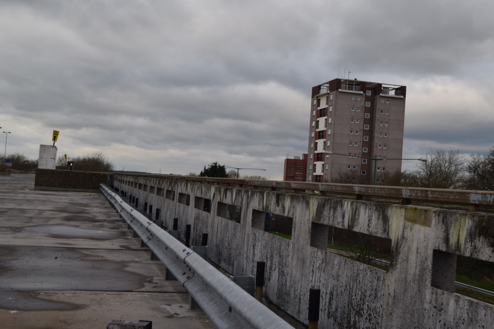
This is another of the landscapes that I took a photo of, this is a very urban photo and because I chose Luxemburg's photos to be inspired by, I made it darker using hue/saturation and I did this because her photos are taken at night, however her photos are typically lit by artificial light coming from buildings, none of the buildings lights were on which makes the photo just seem dark. I love this photo though because I can see so many buildings and I think that grey doesn't always have to be a boring colour.


I had to change this photo quite a lot because it was very slanted, which meant that a lot had to be cropped so it isn't as good as it could've been. I also changed the hue/saturation because I thought it looked a bit dreary and very light.

You have strong image series, for the trip to London think of things you might photograph when in London...
ReplyDeleteI would like to add that the black and white image is really good.. i think some reflection in the work diary is necessary wrt to camera settings, dog and point of focus..
ReplyDelete