Showing posts with label Portraiture. Show all posts

Thursday, 12 May 2016

Artist Research - Alec Soth

This photograph is showing us the mans hobbies and interests, in this project, Soth wanted to show a wide diversity of people in Mississippi. I think that this photo looks like he has been caught during action rather than some of the other photographs in the project which look very staged.

This photograph is showing this womans passion, which from what I can tell, is religion, this project was carried out in Mississippi, which is a state in the bible belt. Soth obviously wanted to show this side of Mississippi in a subtle way.

I really like this photograph, it was taken in a prison in mississippi, it is again showing the religious side of Mississippi with the writing on the top, Soth wanted to show how big a part religion plays in peoples lives.

These are examples of portraiture by Alec Soth, I love his portraits because they show people in mid act, he has caught them in their own home doing whatever they were doing, I also love that the photograph hasn't been cleaned up, the background is cluttered which shows it was an unexpected photograph. Alec Soth's photographs all tend to be quite muted colours which looks quite good I think as they are quite lazy looking photos in general, no one is doing a lot of movement in any of the photos.

Wednesday, 11 May 2016

Artist Research - David Lachapelle

David Lachapelle is a portrait photographer who takes photographs of mostly celebrities, his photographs are extremely saturated like this photograph, this photograph is definitely improved by the saturation, it looks a lot brighter and hotter and the colours are a lot more powerful, it works because the photo is meant to be fun.
However you wouldn't be able to do this with any type of photograph because some photos, like war documentary, is better with muted colour, as it gives meaning to the photo.
Overall I think that this photograph works really well, he has made it look a lot more exciting than it probably was, just by using colour.


This is a photograph of Courtney Love by David Lachapelle, he has gotten inspiration from christian images and ideas for this photograph, to signify Courtney as a godly being. The lighting he has used also shows this, there is light coming from behind her, creating almost a halo around her, although we can se its from the horrible little lightbulb on the ceiling, I love this photograph because Lachapelle has made it look beautiful in what is really a horrible situation.


This is another photograph by David Lachapelle, it is of David Bowie, I think this is a really good photograph because you don't notice David Bowie straight away, theres lots of other characters on there that you might look at first, because next to them, David Bowie is very normal looking. Although, I still think that he is the main subject of the photograph, his face is the only one that looks very human, as the others are all masks. 
In addition, I think that the colours are lovely. The red is very rich, in contrast to the masks which are usually a pink or white colour.

He has inspired me to look at using colour a lot more, I can use different colours to show emotions in my photographs, he has also inspired me to take more portraits, I really like the human form and I could take photographs of this. 

Wednesday, 27 April 2016

Computer Experiments - Six

I used the effect 'Wave' for this photograph, it makes the model look like they are behind frosted glass, although this isn't a very practical filter, I think that it is useful to learn how to use photoshop, which includes filters like this as well as more complicated editing techniques like selective colour. 
To do this edit I made a second layer so that it was easy to delete mistakes, I then clicked filters at the top and then I clicked distort, I then clicked wave and this was the final effect from that.

original


Thursday, 17 March 2016

Computer Experiment Three

This photograph originally had a red top, however I changed the colour because I thought that purple would look nicer, this sort of technique would be good if someone was wearing a colour that clashed with the background, for example red and orange or blue and green. It would make the photo more aesthetically appealing.

To make this effect I used this  to choose the whole top and nothing else, it was easy to use and I had a lot of control over it which was good.

Once I had chosen the whole t-shirt, I then used colour balance to change the colour of the t-shirt. 

Computer Experiment Two

I used the Vignette filter for this photograph, I really like the effect that tho has because it makes the face (or wherever you choose) a lot brighter than the rest of the photograph, which can create an affect similar to focusing on one part of a photo.

To do this photograph, I used curves to make it a lot darker.

I then used gradient to create this effect. This was how I used gradient, it created the effect that you see on the top photograph.


Computer Experiment One

For this photograph I used the filter tilt-shift, I think that this creates a really nice effect that I would be able to use in other portraits, I would possibly be able to use this in a landscape if there is a particular bit of the photograph I want to focus on. The focused bit of the photograph drags your eyes towards it, whereas the rest of the photograph is blurrier and you aren't very dragged to it.

To do this photograph, I had to go to filter at the top of the screen.

I then had to go to Blur Gallery and then Tilt-Shift, this made the photograph have a focused area in the middle that I could move around, whilst the rest of the photo went blurry, it faded out which looks a lot more natural than some other filters which makes it a lot more usable.

Thursday, 4 February 2016

Connecting Essay

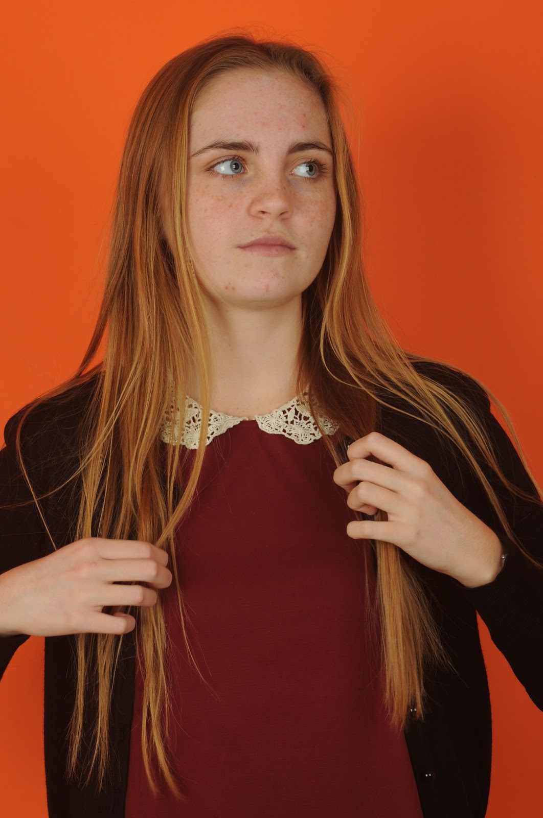
This is my photograph that I took for portraiture, I did this photograph in the style of Thomas Ruff, who does photographs that are in a deadpan style. I really like this style because it shows us that even when you see a photograph of someone, that doesn't mean you have any idea what they are thinking. I think it makes us think about how presumptuous we can be with thinking we know how someone might react to something or how someone might feel about something.

I think that Thomas Ruff's photo is incredible and I think that it shows us a lot about the subject whilst also showing us absolutely nothing, the photographs have a lot of detail in them which makes you feel as though you know them, however they are absolutely dead-pan so we have no idea what they are thinking


Wednesday, 3 February 2016

Connecting Essay

This a photograph I found on the internet by David Bailey, he has used honeycomb lighting to create this effect and I think that it looks really good, it creates a high amount of contrast because on one side it is incredibly lit up and there aren't many shadows at all, however on the other side it has a lot of darkness and shadows, it looks like there is a lot more depth. This could be showing us that there are two sides to him, good and bad, or that there is more depth to him than you would usually see, on the left is what we see but on the right is how he is in reality.
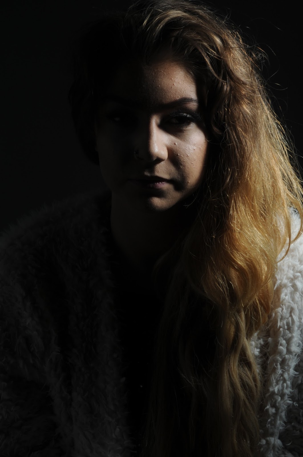
This is my photograph that I took in the studio when I was studying portraiture, I took this using the honeycomb light but I made the photograph a lot darker than David Bailey's photo. In my photo Sarah looks like she has quite a dark personality because one side is completely black and the other has a lot of depth and shadows. This photo was inspired by both Thomas Ruff, who takes passport-like photos and David Bailey who takes photographs with this honeycomb lighting.

Honeycomb lighting is a type of lighting that is more direct and controlled, it means you can make some of the photo very dark and some very bright, it can create a contrast or it can drag the eye to a specific area of a photograph.

Tuesday, 15 December 2015

Work Diary - Portraiture

Work Diary - Portraiture

I thoroughly enjoyed portraiture, I found it a very interesting subject because you can take portraits in a huge number of ways, you can take them dead pan, which isn't very popular because it shows no meaning, however I think that it can have a lovely underlying meaning. You can also take them mid activity, which I also quite like because it catches people naturally, before they put on a face or an act. Portraiture is a very wide term and I don't think it limits you at all. 

Progression - Next time I will take more photos outside, because although I spent time outside taking photos, I took more in the studio, however in the studio it is easier to take photographs because you have more control over the light which makes the photo better.

In my opinion this is my best photograph, I love that this photo has been caught mid activity because it shows that people usually put on a face for photos and in this photo that hasn't happened.

This is my worst photo because it is not centred properly, it also looks very awkward to be honest. I think that the photo shows no emotion and not in a good way.


Thursday, 10 December 2015

Editing on Photoshop - Portraiture

 Editing on photoshop - Portraiture


This is the edited photo, I think this looks worse than the first one because she looks way too pale like she has too much light on her face. The unedited photo, I really think it looked better and could've just done with some editing of the imperfections.


I edited this photograph on photoshop to make it less imperfect, I think this looks good, however, it does look more paler which I'm not sure if I like, however the skin does look smoother. 

To make this effect I firstly got the photograph up, I then went onto image and then mode and then CMYK colour, then I chose the yellow channel and copied it, then I pasted it over the original. after that I inverted it and changed the settings from normal to soft light, then I added a vector mask. Once I had added the vector mask I clicked the paint brush and changed the colour to white, I started painting over the face which made it a little bit more nicer looking.

Vector Mask =

Thursday, 3 December 2015

Image Bank - Portraiture

Image Bank - Portraiture

This photo is a portrait of Jude Law by David Bailey, I think its really well taken and I especially like the contrast of the sides of his face, one side is completely lit and the other side is quite dark, it shows both sides of his personality which looks really good.

This photo was taken by Alec Soth, it is really good in my opinion because it has caught the subject in the middle of doing something, this means it's a lot more natural than a photo like David Baileys because the subject didn't pose for it. I also like that it was taken outdoors because it shows all of the natural clutter that is in people's lives.

This photo is of Angelina Jolie by Annie Leibovitz and it has a huge amount of negative space, this means that your eye is dragged towards her face. I think this photo looks really nice because her face is in a lot of detail.

Photos by Thomas Ruff like this one, are typically deadpan. I think this looks good because it is so simple, although these photos could be taken in someplace like a Photo Booth for example, I think the lighting would probably be better in this photo as it is changed specifically for the person. For example, we can tell that in this photo the light was above him a bit because there are shadows from his eyebrow bone, you might not get that effect in a photo booth.

This photograph of John Lennon and Paul McCartney was taken by David Bailey, I really like his work and I think this piece is good, however I do prefer the one of Jude Law because I think the lighting is more interesting in that one. However this is also good in my opinion because it portrays them as very positive people - there aren't many shadows on their face's unlike Jude Laws portrait. 


Artist Research - Thomas Ruff

This photograph is lovely in my opinion, the subject has a very interesting face, as it isn't symmetrical, Thomas Ruff's photos are similar in that they are all deadpan, however, they are very different because each person is different. the colours they have chosen to wear may show an underlying emotion that isn't shown through facial expressions or body language in the photo.
In this photograph I think that the model is showing emotion, I think that he is almost smiling and part of me seeing this may be the fact that he is wearing yellow, yellow is a colour that signifies happiness for most people and I think Ruff knew this when he took the photograph.

I love his photographs, although they are very similar in that they all show no facial expression, however in some ways this is better, you can choose to see any emotion you want in these people, they are easy to relate to because you have no definite idea what they are feeling. Furthermore, I really like the colours in this photograph, the hair and shirt are the same colour and they are very plain dull colours, so as not to show any connotations towards emotions.

I chose to study Thomas Ruff's portraits for Portraiture, I really like his work because I think it's very simple. It is similar to how a photo would be taken in a Photo Booth, the lighting isn't inventive and I think it's just very direct and face on. I like his photos because it shows us that even though you can see peoples emotions in other photographs, it doesn't mean we actually know how they're feeling.


Research For Portraiture

Research for Portraiture

F 4, 5.6 or 8 to get best photo in the studio.

How to make a vignette effect on photographs:
Create a new copy of the background layer, use curve and make it darker, then use the gradient tool and drag from the face to the side of the picture.


This are photos showing what I actually did on photoshop to create the vignette effect.