Showing posts with label Best. Show all posts
Tuesday, 2 February 2016
Tuesday, 26 January 2016
Straight Images (updated) - Colour
This is my edited photo of the original below, I have made the wall more orange using colour balance. I did this so that the colours compliment each other more. Doing this made the picture appear warmer as the blue looks darker. I liked the original photograph because I think it was framed well, however with the blue being darker and the wall looking more orange I think it is a lot better. This is one of my favourite photographs that I took today and I used f/5, iso 400 and shutter speed 1/25 to capture the original.
This is the edit of the photograph below, I love this photograph because I think that the depth of field looks really good. I also like how the contrast looks because I made the sign a richer yellow and the background slightly darker, however I personally think that the original might be better because the photo overall looks darker now that I have edited it.
This edit is a lot better than the original in my opinion because the red looks more red rather than slightly purply like in the original. To do this I used colour balance and I made the red stand out more, I also did this for the green because it was quite a muted green previously. To do this on Colour Balance, I brought the yellow/blue bar down -12 so that there was less blue, this made the postbox more red, I then pulled the green bar up +15 to make the green a lot richer.
This photo is of a red plant next to a green one, I think that the contrast looks really good now that it's been edited, I used colour balance and made the red bar higher, I also used curves to make the photo darker in places, I think that this makes the photo look a lot better as it may have been over-saturated originally.
This is the edited photograph, to make this I had to rotate the photograph because it wasn't straight, however, I don't mind the original as I think it was just the angle, I could've left it without rotating and had just a good photo. I also used colour balance to make this, I wanted the photo to look cold so I brought the red/cyan bar down -15 so that the photo was more blue. I additionally used hue/saturation to make the colours more muted as you can see from the colour of the grass in the original compared to the edited one. Then I used curves to make parts of the photograph darker. I think that overall, this photo is one of my best from todays shoot, however it isn't a great example of colour.
Wednesday, 20 January 2016
Straight Images - Landscape
This is my final edit of the photograph, I took this using the settings f.22 and iso 200, the shutter speed changed depending on how dark it was because my camera was on aperture priority. I used rotation to level this photo out more because although I used a tripod, I didn't set it up very well so it was a slanted photograph. I also edited it using curves, I made the photograph a bit darker but I'm not sure if I like it because I think it might look too dark
This is the original photograph, it is slanted and therefore I don't think it looks very good, it looks quite unprofessional unlike the edited photo.
I didn't need to straighten this photograph because it was already straight, however I decided to make it black and white, slightly inspired by Ansel Adams, however Adams used a very big contrast in his photos, I didn't want to do that because I didn't think it would look that good in this photo. I used f.3.5 and iso 3200 for this photo, I should've used a tripod for this photo like I did with the last one, it would've been better and I could've taken a better photo.

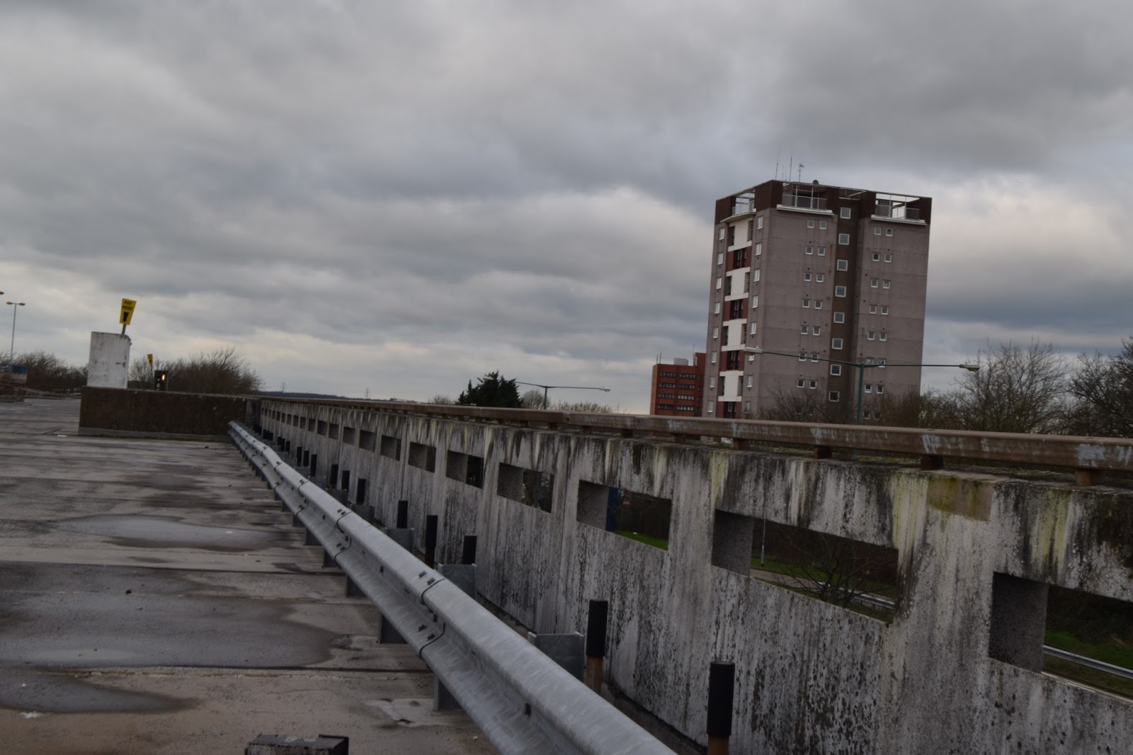
I really liked this photo because it looked very urban, however I felt that as it's meant to be inspired by Rut Blees Luxemburg, that it was too bright, I couldn't take this photo at night like she took her photos but I tried to make it darker using saturation, I lowered the saturation of the photograph. By doing this I made the photo have a higher contrast, similar to Ansel Adams photo's.
This is another of the landscapes that I took a photo of, this is a very urban photo and because I chose Luxemburg's photos to be inspired by, I made it darker using hue/saturation and I did this because her photos are taken at night, however her photos are typically lit by artificial light coming from buildings, none of the buildings lights were on which makes the photo just seem dark. I love this photo though because I can see so many buildings and I think that grey doesn't always have to be a boring colour.
I had to change this photo quite a lot because it was very slanted, which meant that a lot had to be cropped so it isn't as good as it could've been. I also changed the hue/saturation because I thought it looked a bit dreary and very light.
Wednesday, 16 December 2015
Tuesday, 8 December 2015
Straight Images - Motion
Wednesday, 2 December 2015
Tuesday, 20 October 2015
Straight Images - Reflection
Original
Edited
Original
Edited
Original
Edited
Original
Edited
These are my best 5 because they show reflection best and I think most of them are quite subtle, the green vase is quite reflective but it could also be seen as a line piece as it shows a few different types of lines, straight, diagonal, curved etc. The building also looks like a line piece but it also reflects the clouds.
Subscribe to:
Posts (Atom)