Showing posts with label Editing. Show all posts

Wednesday, 27 April 2016

Computer Experiments - Six

I used the effect 'Wave' for this photograph, it makes the model look like they are behind frosted glass, although this isn't a very practical filter, I think that it is useful to learn how to use photoshop, which includes filters like this as well as more complicated editing techniques like selective colour. 
To do this edit I made a second layer so that it was easy to delete mistakes, I then clicked filters at the top and then I clicked distort, I then clicked wave and this was the final effect from that.

original


Thursday, 17 March 2016

Computer Experiment Three

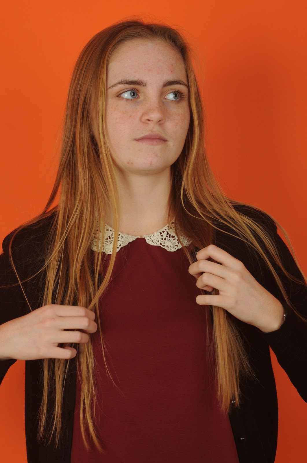
This photograph originally had a red top, however I changed the colour because I thought that purple would look nicer, this sort of technique would be good if someone was wearing a colour that clashed with the background, for example red and orange or blue and green. It would make the photo more aesthetically appealing.

To make this effect I used this  to choose the whole top and nothing else, it was easy to use and I had a lot of control over it which was good.

Once I had chosen the whole t-shirt, I then used colour balance to change the colour of the t-shirt. 

Computer Experiment Two

I used the Vignette filter for this photograph, I really like the effect that tho has because it makes the face (or wherever you choose) a lot brighter than the rest of the photograph, which can create an affect similar to focusing on one part of a photo.

To do this photograph, I used curves to make it a lot darker.

I then used gradient to create this effect. This was how I used gradient, it created the effect that you see on the top photograph.


Computer Experiment One

For this photograph I used the filter tilt-shift, I think that this creates a really nice effect that I would be able to use in other portraits, I would possibly be able to use this in a landscape if there is a particular bit of the photograph I want to focus on. The focused bit of the photograph drags your eyes towards it, whereas the rest of the photograph is blurrier and you aren't very dragged to it.

To do this photograph, I had to go to filter at the top of the screen.

I then had to go to Blur Gallery and then Tilt-Shift, this made the photograph have a focused area in the middle that I could move around, whilst the rest of the photo went blurry, it faded out which looks a lot more natural than some other filters which makes it a lot more usable.

Thursday, 10 December 2015

Editing on Photoshop - Portraiture

 Editing on photoshop - Portraiture


This is the edited photo, I think this looks worse than the first one because she looks way too pale like she has too much light on her face. The unedited photo, I really think it looked better and could've just done with some editing of the imperfections.


I edited this photograph on photoshop to make it less imperfect, I think this looks good, however, it does look more paler which I'm not sure if I like, however the skin does look smoother. 

To make this effect I firstly got the photograph up, I then went onto image and then mode and then CMYK colour, then I chose the yellow channel and copied it, then I pasted it over the original. after that I inverted it and changed the settings from normal to soft light, then I added a vector mask. Once I had added the vector mask I clicked the paint brush and changed the colour to white, I started painting over the face which made it a little bit more nicer looking.

Vector Mask =

Thursday, 3 December 2015

Editing - Depth of Field

Editing - Depth of Field


This photograph was over exposed in the first photograph I think. It didn't have the effect I wanted it too so I changed it by using these filters and effects:
Unsharp mask - to make everything a lot more focused.
Curves - to make the picture darker.
Hue/saturation - I made the saturation a bit higher (+4) and I made the picture a little bit darker (-13).


I loved this photograph so I didn't want to edit it too much, however I thought that little changes would make a lot of difference in this case, rather than over-editing a bad photo to try and improve it.
I used the filters/effects:
Levels - I used this to do white balance which improves the photographs a lot and makes the colours more realistic.
Hue/Saturation - I used this to make the colour "pop" a bit more as I was worried it looked a bit too muted. I made it more saturated (+18) and a bit darker (-9).


Wednesday, 2 December 2015

Editing - Portraiture

Editing - Portraiture


I edited this photograph by making it darker using the curve tool, I also fixed small bits using the blemish tool. I then changed the background colour slightly so that it wasn't the same colour as his jacket's hood lining.


For this photograph I used curves to make the photograph a lot darker, I then used gradient to make the face lighter whilst keeping the rest of the body darker, this is a technique called Vignette and I used it to drag the eye to the face rather than focusing on other parts of the photo that aren't important.


I used white balance on this photograph which definitely improved parts of the photograph, however I think I made it too dark as it is quite a moody looking photo, I think that the skin looks better in the edit because it was quite a sickly photo at first, I also think the hair colour is a lot better and the eye colour is a lot brighter which looks good.


I used a few tools on this photograph, I used levels to white balance the photo a little bit, I then used the curve tool to make it darker and the gradient tool with that to brighten the face and drag the eye to it. I don't think this worked as well as it could've and I should've made it darker when using the curve tool.


I really like this edit because it looks a lot better than the original, the colours are a lot more realistic because I used the white balance. however I think the hair looks like a nicer colour in the original. I used levels to do white balance and I also used curve to make it a little bit lighter which may have been a bad idea as I think it might be a bit too bright.


The bottom one is the edited photograph, I have made many changes to this photograph. I first changed the white balance which made the photograph look a lot warmer, I then changed the curves and made it a little bit darker, I also sharpened the photograph by 3 pixels using the 'unsharp mask', then I decided I wanted the photograph to be more saturated, however the tree was already too bright so I selected it and inversed it before making the saturation higher. I then reselected the tree and made it more muted, this meant I ended up with a picture I was very happy with that was a lot better than the original.