Thursday, 24 March 2016

Computer Experiment Five

This is a joiner that I created, I think that it actually worked quite well and is probably my best joiner of the three I created, I don't think that this is a effect that I would use often as it is quite time consuming, however if done right, it can look really good.

To do this photograph, I had to take photographs of Fern from lots of different angles, this took quite a while because I didn't want them to have much shadowing on them because it would've looked really bad. 
Once I had the photographs, I had to create a new photo with nothing on it and drag photographs on after, I only used five photos to make this but I think that it looks quite good.

Computer Experiment Four

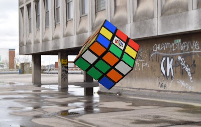
This is my fourth plinth photograph, I think that it isn't my best computer experiment, however I do like it because it looks almost like the Rubik Cube is 3D and coming out of the screen, I like this photograph a lot, even if I don't think it's my best one.
To make the photo like this I had to take photos of the Rubik Cube in the Studio, this didn't take very long but we had to set up the lights to do this. 
I then cut out the shape on photoshop and dragged it onto the urban landscape photograph. I think that it had this effect because of the different lighting on each photograph.

Thursday, 17 March 2016

Computer Experiment Three

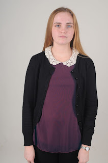
This photograph originally had a red top, however I changed the colour because I thought that purple would look nicer, this sort of technique would be good if someone was wearing a colour that clashed with the background, for example red and orange or blue and green. It would make the photo more aesthetically appealing.

To make this effect I used this  to choose the whole top and nothing else, it was easy to use and I had a lot of control over it which was good.

Once I had chosen the whole t-shirt, I then used colour balance to change the colour of the t-shirt. 

Computer Experiment Two

I used the Vignette filter for this photograph, I really like the effect that tho has because it makes the face (or wherever you choose) a lot brighter than the rest of the photograph, which can create an affect similar to focusing on one part of a photo.

To do this photograph, I used curves to make it a lot darker.

I then used gradient to create this effect. This was how I used gradient, it created the effect that you see on the top photograph.


Computer Experiment One

For this photograph I used the filter tilt-shift, I think that this creates a really nice effect that I would be able to use in other portraits, I would possibly be able to use this in a landscape if there is a particular bit of the photograph I want to focus on. The focused bit of the photograph drags your eyes towards it, whereas the rest of the photograph is blurrier and you aren't very dragged to it.

To do this photograph, I had to go to filter at the top of the screen.

I then had to go to Blur Gallery and then Tilt-Shift, this made the photograph have a focused area in the middle that I could move around, whilst the rest of the photo went blurry, it faded out which looks a lot more natural than some other filters which makes it a lot more usable.