Thursday, 22 October 2015

Work Diary - Texture

Work Diary - Texture

Today I was told to take pictures of texture, I found this quite easy, especially when using the colleges macro lens camera as I could get very close to take the picture, meaning you could see the texture better, I liked looking for things that had nice texture that would show well when I took pictures of it, like some leaves, or the wool that I found in Wilkinson's.

Progression: Next time I will look outside more because I found a lot of good examples of beautiful textures in leaves and tree trunks. Although the textures I found inside were good examples, I personally think that the ones I took outside usually looked better.


I like this photo because you can really see what the texture of the leaf feels like. The focus is very good because the background is blurred, however the side of the leaf at the bottom right is a bit blurry as well which slightly ruins the photograph


I don't like this photograph because although the texture is good and I can see it really well, the subject is horrible and I think I took a lot better photographs.

Wednesday, 21 October 2015

Work Diary - Reflection

Work Diary

Today I went out around Harlow town and the college campus to look for pictures of reflection, I found this quite hard even though I knew what I was looking for as the town and campus lacked in things that were reflective and looked good. I found a few buildings that looked good and I also found a pond with things that could've reflected but the water was an odd colour which meant that it didn't look very reflective, or nice.

However I did find some things inside shops that were quite reflective, they also tended to be clean which meant that the reflection looked good. These photos from inside the shops were some of my best photographs.

Progression: next time I will look in more places for reflection. I don't think I spent enough time outside looking for photographs. 


Although it's not the best reflection, I think it was reflective enough that it could be seen as a reflective photograph, I used the camera on its auto settings, even though it was quite simple, it looks good as it focus' on the main object of the photo. It makes the photograph pop more.


I don't like this because it looks faded and tacky, it isn't a very good photo and I don't think I was trying hard enough so that's why some of my photos are that good at all. Although this photograph is very reflective, more so than some of my better photographs, I don't like it, the lighting is too bright and it looks over exposed.


Tuesday, 20 October 2015

Straight Images - Reflection


Original
Edited 

Original
Edited

Original
 Edited

Original
Edited

These are my best 5 because they show reflection best and I think most of them are quite subtle, the green vase is quite reflective but it could also be seen as a line piece as it shows a few different types of lines, straight, diagonal, curved etc. The building also looks like a line piece but it also reflects the clouds.

Contact Sheet - Reflection


Image Bank - Reflection


I really like this photograph because I think it shows reflection just subtly enough, it is only a faint reflection of the sky which I like because it is just the colours really, I also think the silhouette of the man looks good especially with the reflection.


This is a less subtle photograph showing reflection but I really like it because it is not just a straight reflection, it is slightly morphed because of the shape of the object, this makes the people and the buildings look odd.


I really like this photograph because it isn't very subtle. I think the lights are the thing that drags your eyes the most, however the reflection just adds to the photograph and makes it look even better than it would on its own, it makes the photo more unique.


I think this photo looks good because it isn't obviously reflection, it is a very sharp photo which drags your eyes to the shapes in it, the angle the photo was taken in makes the buildings look triangular which isn't a regular building shape. the reflection makes the photo better in my opinion as it makes the building less contrasted.


The colours in this photo are what attracted me to it the most, yellow is a very bright colour and it happens to be a main part of the photograph, this matches with the green of the water and I think that looks very good.


Artist Research - Vivian Maier

This photo by Vivian shows reflection, it portrays her as unfocused and quite transient. She puts herself in many of her pictures because she was quite alone, she didn't have many friends, she learnt English from theatre and plays, her theatre of life was acted out in front of her camera and she wanted to be a part of it. She didn't have any family, nor did she ever marry, she was a very singular person that probably wanted to be remembered and the only way that could happen was through her photos.

I do think her work should be considered as art, although many of them are very casual and don't seem to be staged at all. I think it is easy to look at and quite calming as not too much is going on and it seems to me to be quite relaxed and happy. Many of her black and white photographs are like this, they only have a few characters in them and the background of the photo isn't very busy.

This photograph by Vivian Maier shows a man on the street. He is very dirty, even in contrast to the wall. I like this photo because I think the subject is framed very well, none of arm is cut off on either side.


Definition Post - Reflection

Reflection

Reflection photography is the art of using reflective surfaces like mirrors, glass or bodies of water to capture beautiful images. However mirrors aren't commonly used because they are quite difficult to work with as any streaks or blotches on the mirror can ruin the photo and filters can make the photograph look dull.
Personally I think reflection can be very tacky as a photography form, it is sometimes overused and can look terrible, however, when used correctly and subtly it can be absolutely stunning.

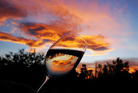
This is an example of good use of reflection in my opinion. I think that this shows reflection quite subtly which can sometimes look a lot better than very obvious reflection.

I love this picture because it is very simple, it isn't very clique either as I haven't the mirror idea around that much, I also like that the person is wearing all black as it means your eye is drawn to the mirror rather than them.

I quite like this photograph because I think the eye isn't necessarily being dragged to the bikes reflection rather just the bike, which happens to be a silhouette in this photo which looks better than a lot of colour would in contrast with the sky.

I love this photo, primarily because of the beautiful colours, however the reflection looks amazing as well, I love the fact that it's distorted and I think that it looks really good and although its not very original it is still very nice.


Work Diary - Shape

Work Diary

Today I went out and took pictures around Harlow town and Harlow college campus, I was looking at the formal element 'shape', I did a lot more research before going out this lesson which meant I knew more what I was looking for, so although I had some problems with the camera settings which made the photographs too light, I still managed to get a lot of good ones. Next lesson I am going to take pictures in the studio which will hopefully mean I get a some better quality photos.

Progression: next time I go out I will make sure my camera settings are right so that I can get photos that will look as good as possible and also make best use of the time I spend taking photos.


This photograph is terrible and is probably my worst, I really don't like it, the whole photo is really badly lit and it's not framed very well, even the rock is an odd shape and looks bad.

I love this photograph because I like the angle I took it from, it makes the object look a lot bigger than it was. I also think the sky looks really good in the background and I like the lighting in this photo. The sky is very bright and the main subject of the photo is dark which looks really nice, I think the negative space would be the subject.


Studio Work best 5 - Shape

I chose these as my best five from the studio work because I think they are the best in terms of how I had the lighting and how I had them fitted in the photo.

Studio Work- Shape


Best 5 - Shape

I chose these as my best 5 because I think they show shape best, I especially like the last one because it has a sort of contrast.

Contact Sheet - Shape


Bill Brandt Research - Shape

Bill Brandt Research

Bill Brandt took a series of pictures of the female form in the late 1940s onwards of the female figure as a celebration of peace after the second world war.


This photo was taken in 1951, it is of a woman's legs, the shape of the leg that is leant on the other leg is much more curvy and shaped than the other, this makes it seem more feminine. the shadows on the leg emphasise it even more as it gives it even more shape and depth. 


This photo was taken in 1977, it is of a woman's back at the seaside, the curves of her body signify calming feelings as we learnt during the line project when we found that in photographs curved lines show calm and peacefulness, this makes sense with the aim of his series.

Some people have said that his pictures are sexually objectifying women but I don't think that is what he is trying to do, I see them as him celebrating a natural form.


Image Bank - Shape

Image Bank 


This photo shows a variety of shapes and lines, the tallest building looks like a triangle from this angle however it is actually a rectangle building, the other buildings also look like geometric shapes, this picture doesn't have many irregular shapes other than the clouds, however they are in the negative space.


This photo is of a leaf with a frog on the top, I think the frog would be the negative shape in this photo as it is the shadow of the frog rather than the actual frog. The negative space is the main focus of this photo which I think looks nice.


This photo is a silhouette of a man walking with some camels, in this photo the sky would be the negative space because the camels is what your eye is drawn too mostly, however the camels could also be the negative space as your eyes are also drawn to the sun in the background. 


This photo is of salt and pepper pots, although this is the main part of the photograph, I think the background shows shape better as it is quite nice and detailed. It could also show pattern.


This photograph is of a few buildings, I think they look good because of the angle they've been taken from, it makes them look more morphed than they usually do, they don't look like their usual shape and some of them even look triangular.


Definition - Shape

Shape

Shape can be geometrical, for example, squares, triangles and circles. Shape can also be irregular, these are shapes like the human form, or flowers, many shapes in nature are irregular although some do follow a pattern like snail shells. This follows the Fibonacci pattern which is a mathematical sequence that shows up a lot in nature.

The fibonacci sequence in nature

This is a picture of the edge of a building from an angle looking up, it looks like a triangle however it is a rectangle building. I think it's cool that you can manipulate it like this.

This is an example of shape, although it is also an example of pattern. This is a regular hexagon and it wouldn't be found in nature, this is likely a man made structure.