Thursday, 3 December 2015

Research For Portraiture

Research for Portraiture

F 4, 5.6 or 8 to get best photo in the studio.

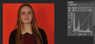
How to make a vignette effect on photographs:
Create a new copy of the background layer, use curve and make it darker, then use the gradient tool and drag from the face to the side of the picture.


This are photos showing what I actually did on photoshop to create the vignette effect.


Wednesday, 2 December 2015

Contact Sheet - Portraiture

Contact Sheet - Portraiture


How I Made Joiners

How I made Joiners

I made my joiners digitally on photoshop, however it was originally done by laying out polaroids, I also did mine differently from originally in that I overlapped my photographs, in the original way they didn't overlap at all, they were laid next to each other. I firstly made a plain A4 sized document on photoshop, then I put all of the photos I took of the object/person etc onto photoshop as well, I then went through all the photos and chose the ones that looked best and put them on the plain document. I then was able to arrange them however I wanted. Because they were in different layers it meant that I wouldn't accidentally move any of the others by accident.

Work Diary - Joiners

Work Diary - Joiners

In this lesson we took a lot of photos of one thing so that we could merge them together to create a new photo, I did one of a face, one of a vase and one of a building, however I didn't take enough pictures of the building so this joiner wasn't very good. This was quite a difficult task and although it was dragged over two days, I was still only able to make three joiners in total because of how many photos were needed for each joiner, I did enjoy this task even though it was quite difficult.

Progression: Next time I will spend longer getting pictures, that way I will not need to work too hard on trying to make a photograph out of nothing.

In my opinion this is my best joiner because it looks like what it was originally, although slightly warped, however it probably would've been better if I was able to find a coloured vase as this one is quite hard to see at parts.

I think this is my worst photo because it doesn't fit together properly and I didn't get enough photographs to make it well. Also the colours aren't the same, some of the photos are a lot darker than others which doesn't merge to make a good joiner.


Straight Images - Portraiture


Editing - Portraiture

Editing - Portraiture


I edited this photograph by making it darker using the curve tool, I also fixed small bits using the blemish tool. I then changed the background colour slightly so that it wasn't the same colour as his jacket's hood lining.


For this photograph I used curves to make the photograph a lot darker, I then used gradient to make the face lighter whilst keeping the rest of the body darker, this is a technique called Vignette and I used it to drag the eye to the face rather than focusing on other parts of the photo that aren't important.


I used white balance on this photograph which definitely improved parts of the photograph, however I think I made it too dark as it is quite a moody looking photo, I think that the skin looks better in the edit because it was quite a sickly photo at first, I also think the hair colour is a lot better and the eye colour is a lot brighter which looks good.


I used a few tools on this photograph, I used levels to white balance the photo a little bit, I then used the curve tool to make it darker and the gradient tool with that to brighten the face and drag the eye to it. I don't think this worked as well as it could've and I should've made it darker when using the curve tool.


I really like this edit because it looks a lot better than the original, the colours are a lot more realistic because I used the white balance. however I think the hair looks like a nicer colour in the original. I used levels to do white balance and I also used curve to make it a little bit lighter which may have been a bad idea as I think it might be a bit too bright.


The bottom one is the edited photograph, I have made many changes to this photograph. I first changed the white balance which made the photograph look a lot warmer, I then changed the curves and made it a little bit darker, I also sharpened the photograph by 3 pixels using the 'unsharp mask', then I decided I wanted the photograph to be more saturated, however the tree was already too bright so I selected it and inversed it before making the saturation higher. I then reselected the tree and made it more muted, this meant I ended up with a picture I was very happy with that was a lot better than the original.


Definition Post - Portraiture

Definition Post - Portraiture

Definition: A portrait is a painting, photograph, sculpture or other artistic representation of a person, in which the face and expression are predominant. The intent is to display the likeliness, personality and even the mood of the person.

This portrait by Alec Soth is of a man called Joshua in Angola State Prison, it is a portrait from Alec Soth's 'Sleeping by the Mississippi' project, I love this photo because I think you can see how the subject feels, the photographer has caught him before he could pose which creates more authentic emotion, rather than someone just putting on a face for the camera.

 This is a photograph by Thomas Ruff, he takes photographs of people in a deadpan position, this means  that devoid of any emotion. These portraits are showing us that although it seems like we are looking at someone that we can connect and understand, it is impossible to represent someones emotions photographically. The people he took photos of were completely normal and they are a canvas that we can portray our emotions onto, although we can't know how they actually feel.

This is a photograph of a man called Robert Rauschenburg by Chuck Close, Chuck Close does photography and hyper-realistic paintings. I like his art style because it captures people mid-action, this means we see more of their personality and how they act. It isn't just deadpan and emotionless, which can look good but it is nice to see some emotion. I also like how this is lighted, the background is black as well as his shirt and then his face and hair is very bright which obviously attracts your eye to that. 

This is a photo by David LaChapelle for his 'Shut In' collection, I think this is a lovely photograph because it shows so much happiness, this lady is doing what she loves in the photograph (drawing patterns), we can tell she loves doing it because the background of the photograph is completely covered in them.